
Ready-made template for user manuals and other forms of technical documentation
It often takes many hours just to find out how certain things can be set in Microsoft Word, OpenOffice, LibreOffice, or another word processor. Even more time is then spent actually making the settings in detail.
Next, it takes many more hours to give the manuals a professional look down to the last detail. Set up - test - improve - test again - improve again ...
However, a stylish design alone is not enough: users must also be able to find their way around the manuals created with the template: Even the first glance at the document should provide sufficient visual guidance. The texts must be clearly legible in every situation – even under difficult conditions.
Last but not least, you as the author should also be able to work efficiently with your template. A clear layout helps you too when writing. Moreover, you will save lots of time if the template makes full use of the automation potential of your authoring tool – for example, by applying well-considered settings for automatic page breaks.
Fully preconfigured: indoition Technical Documentation Template
Using a preconfigured template for technical documentation saves you many hours of valuable time and helps you avoid strategic mistakes from the start when creating the styles.
The indoition Technical Documentation Template is such a preconfigured template for creating user manuals, operating instructions, IT documentation, and other forms of technical documentation. It is based on more than 30 years of experience in technical documentation and template development.
You can either use the indoition Technical Documentation Template right away as it is, or you can customize the existing styles and settings defined in the template to suit your company's internal design specifications.
The indoition Technical Documentation Template is fully compatible with Microsoft Word, OpenOffice, and LibreOffice. However, it also works to a large extent with other word processors and authoring tools that can read .DOCX or .ODT files.
You can buy and download the indoition Technical Documentation Template for EUR 19.90 here.
The template only uses graphical elements that serve a practical purpose, such as guiding the reader’s eye to the relevant content.
That's why the design of the style sheet supports readers from the outset in quickly skimming and scanning a document to find the information they need. Your customers will appreciate this!
The template has been designed so that readers can always grasp the structure of a document at a glance: not only within the table of contents but also within the middle of the text.
The user manual template uses white space wisely.
The user manual and technical documentation template applies clear standard fonts that are large enough to make the text easy to read. Yet the fonts remain small enough to fit enough information on a page.
The template uses a well-balanced line length that does not make reading unnecessarily difficult.
Example: A style that you use for formatting the name of a button is not named “Arial10ptBold” but “button”. If, for example, one day you want to change the format in a user manual from “Arial 10 point bold” to “Verdana 12 point blue italic”, you can do this without having to create a new style and reassign it everywhere. You simply update the appearance of the existing style.
In the template, keyboard shortcuts are assigned to the most frequently used styles. The keyboard shortcuts use characteristic letters from the respective style names so that you can easily remember the shortcuts.
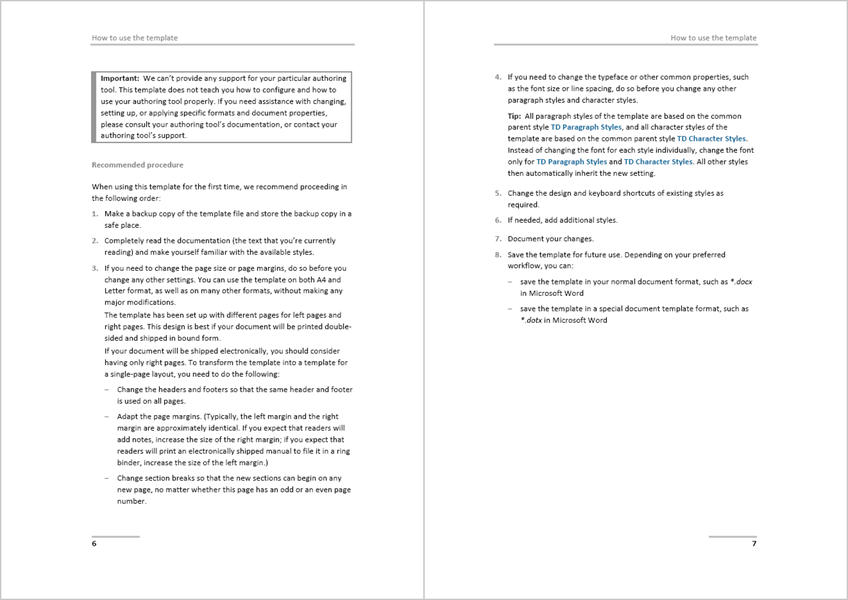
Each format has the optimum settings for controlling whether a page break may interrupt the paragraph, whether a particular paragraph should always be at the top of a new page, whether a particular paragraph should always be on the same page as another paragraph, etc.
In case you need a paper size other than A4 or Letter, you can adjust the format template accordingly at any time.
Optionally, you can customize the template at any time to give your manuals a distinctive look or to adapt the design to your company's corporate identity. Adapting existing styles typically only requires some basic editing skills in your authoring tool, such as Microsoft Word.
You can create as many documents as you need with the license.
Use the indoition Technical Documentation Template instead of wasting many hours setting up your own template. To obtain an individual design, all formats can be adapted with little effort if needed.
You can buy and download the indoition Technical Documentation Template for EUR 19.90 here.
Tips for designing your own user manual templates
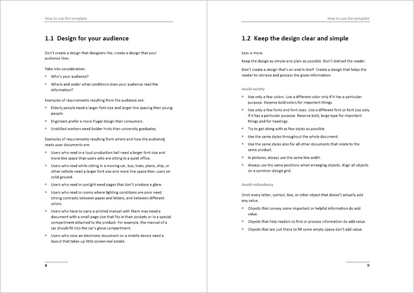
Design for your audience
Don’t create a design that designers would like. Create a design that meets the needs of your audience.
- Who are your readers?
- Where and under what conditions will your readers read your user manuals?
Examples of requirements resulting from the audience are:
- Elderly people need a larger font size and some larger line spacing than young people.
- Engineers in general prefer a more frugal design than consumers.
- Unskilled readers need bolder hints than university graduates.
Examples of requirements resulting from where and how the audience reads your user manuals are:
- Users who read in a loud production hall need a larger font size and some more line space than users who are sitting in a quiet office.
- Users who read while sitting in a moving car, bus, train, plane, ship, or other vehicle need a larger font size and some more line space than users on solid ground.
- Users who read in bright sunlight need pages that don’t produce a glare.
- Users who read in rooms where lighting conditions are poor need some strong contrasts between paper and letters, and between different colors.
- Users who have to carry a printed manual with them may need a document with a small page size that fits into their pockets or into a special compartment attached to the product. For example, the user manual of a car should fit into the car’s glove compartment.
- Users who view an electronic user manual on a mobile device need a layout that takes up only little screen real estate.
Keep the design clear and simple
Less is more. Keep the design of your user manual template as plain and simple as possible. Don’t distract the reader. Create a design that helps the reader to retrieve and process the given information.
Avoid unnecessary variety
- Use only a small number of different colors in your user manuals. Use different colors only if they serve different purposes. Reserve bold colors for important things.
- Use only a small number of different fonts and font sizes. Use different fonts or font sizes only if they serve a particular purpose. Reserve bold, large type for important things and for headings.
- Try to get along with as few different styles as possible.
- Use the same styles consistently throughout the whole user manual.
- Use the same styles also for all other documents that relate to the same product: installation guides, getting started guides, user guides, operation manuals, reference manuals, maintenance manuals, etc.
- Always use identical positions when arranging objects. Align all objects on a common design grid.
Avoid redundancy
Omit every letter, symbol, line, or other object that doesn’t add any real value.
- Objects that convey some important or helpful information do add value.
- Objects that help readers to find or process information do add value.
- Objects that are just there to fill some empty space don’t add value.
For example:
- Don’t use background images.
- Don’t put your company logo on each page. It’s enough to have it on the title page.
- Don’t mention the author’s name on each page.
- Don’t put a copyright notice on each page.
- Don’t put a revision number or release date on each page.
- Don’t put the document title on each page.
- A running header or footer that shows the title of the current section, however, can be helpful because it keeps readers oriented.
Tip: Sometimes, the design guidelines of a company inevitably require having particular elements on each page, no matter whether this makes any sense. If, in a case like this, you can’t influence the design guidelines (you should try), at least keep these elements as unobtrusive as possible: make them small, don’t use color, make text light gray instead of black, place the elements where they draw little attention and clearly separate them from the true content.
Avoid clutter
Don’t overload the pages of your user manuals and user guides with too much information. Use white space purposefully to direct the readers’ attention, to group things that belong together, and to set reading pauses.
It’s no problem if an uncluttered layout makes your user guides a bit longer. If you provide valuable content, readers will accept the fact that they need to scroll or turn pages. However, they won’t accept user guides that overwhelm them.
Create styles semantically
Use style names that describe the meaning of a style, not its look. For example, call a style “Emphasis” rather than “Bold-Red.”
Semantic styles have some major advantages:
- The style name tells you when to use the style meaningfully.
- You can change the look of the style at any time without any negative side effects. Example: Imagine having designed a special style for formatting user interface elements. If you have named this style “element”, for instance, you can later simply change the font settings. If you want to change the font from Arial to Verdana or the size from 10pt to 12pt, you can do so and this is it. But what would you do if you had named your style “Arial-10pt-Bold”? This wouldn’t make much sense any longer …
- Semantic styles are a key prerequisite for structured authoring in XML and DITA. If you use semantic styles, your user manuals are well prepared in case you want to shift to structured authoring someday.
Use a well thought out naming convention
To make your user manual template writer-friendly, set up an effective naming convention for style names:
- Choose names that you can remember easily.
- Choose names in a way so that related styles are listed next to each other in the style catalog of your authoring tool. You can achieve this by beginning the names of related styles with the same prefix.
- For keyboard shortcuts, use keys that you can easily remember. Use the same scheme for all paragraph styles and another scheme for all character styles. For example, use Alt+Shift+letter for all paragraph styles, and use Ctrl+Shift+letter for all character styles.
When writing, avoid amateurish formatting techniques
Don’t use …
- empty paragraphs
- multiple space characters
- tabs
- all sorts of local custom formatting
Only use the styles that are configured in your user manual template.
Problems with empty paragraphs
Don’t use empty paragraphs for adjusting the space above or the space below paragraphs. Instead, use appropriate paragraph settings.
Also, don’t use empty paragraphs for creating page breaks. If you later add or delete some lines from your user manual, everything will move to a wrong position. Instead, always use proper manual page breaks. Even better, when possible completely automate page breaks.
All sorts of empty paragraphs seriously interfere with automatic page breaks.
Problems with multiple space characters
Don’t use space characters for indenting text. Instead, always configure proper indentation settings as part of the paragraph properties. If you use space characters for indenting text, as soon as you change anything, all subsequent lines also need manual editing.
In online user manuals that use a variable column width, indents with space characters don’t work at all.
The only place where using space characters for formatting text within a user manual makes sense, is when quoting programming source code. When you copy and paste source code into a user manual, the source code is usually already indented with the help of space characters or tabs.
Problems with tabs
Avoid using the tab key. Tabs may get you into trouble if you want to produce an online version of your user guide because tabs don’t have any equivalent in HTML. Tabs then need to be converted into tables, space characters, or indents. This rarely works well.
Instead of using tabs, set up some proper paragraph indentation, or use a borderless table. Note that even if you don’t need to produce an online version of a user guide now, you may want to do so in the future.
Problems with local custom formatting
Don’t manually set paragraph settings and character settings for individual paragraphs. Always only use the paragraph styles and character styles that have been defined in your user manual template. If you overwrite a paragraph style for an individual paragraph or if you overwrite a character style for an individual word, this will get you into trouble when you need to change the design of your user manuals. This may seem unlikely today but often happens even if you don’t anticipate it.
If you have exclusively used template styles and want to change the design, all you need to do is to change the style definitions. If you’ve applied manual formatting, however, you will need to update all manual formatting by hand. This can result in many hours of extra work, particularly if you have multiple documents.
Use the indoition Technical Documentation Template.